Repository navigation
feat(bootstrap): add Luma design system status Badge component - #27038
Merged
Merged
Conversation


Also drops the BsSize alias system from Badge's size prop (now a plain
SupportedMantineSize) and sets Badge's displayName for Storybook.
bsStyle stays as a legacy fallback resolving through the old, unchanged
color path when color is not set.
react-docgen can't reliably infer types/descriptions from this prop
shape (also why dot showed as an object control) — declare them
explicitly instead of relying on auto-inference.
…lor, drop dot border
Some existing Label/Badge wrapper components (e.g. TitleCell's
DefaultLabel) still pass bsSize directly; treat it the same way as
bsStyle — a deprecated fallback used only when size is not set.
…size names

'large'/'xsmall' were valid BsSize aliases but aren't valid
SupportedMantineSize values now that Badge's size prop takes the
latter directly — flagged during planning but never actually fixed.
getByText resolved to Mantine's inner .mantine-Badge-label span, which
carries no styled-components class, so toHaveStyleRule silently reported
"no rules found" — a hard fail for the positive assertion and a
false-pass for the negated one. Query the actual styled root via a
data-testid instead.
…m its API

Label wrapped Badge directly, so it silently inherited every new
color/variant/dot/leftIcon/rightIcon/size prop Badge grew during the
redesign. Restrict Label's props to bsStyle/bsSize plus generic
pass-through, and revert call sites that had been renamed onto Badge's
new size prop, so Label keeps its original small-pill look regardless
of how Badge evolves. Border-radius is now unconditional since Label
can no longer receive a color prop.
Both were the two interactive (toggle-on-click) status cells flagged in
Graylog2/frontend#43 as needing the new component. Use Badge's
color/variant/dot/rightIcon props directly instead of Label plus
hand-rolled cursor/divider styling.
Was inheriting Mantine's default 700.
Collector source and stream output filter rule enabled/disabled
indicators; both already used the correct success/warning colors, just
via legacy Label with (in the filter rule case) dead clickable styling.
System job and content pack status badges each had their own
styled(Badge) wrapper computing colors from theme.colors.variant.dark
by hand. Use color/variant/dot instead, so they pick up the same
palette as every other status badge. 'info' has no equivalent in the
new color set, so queued/updatable map to gray.
Use it for a live, actively-changing process state (a toggle, a
running job) — not a static, stored attribute. The previous wording
pointed at Event Definitions as an example, which no longer uses dot.
… text

Also drops the explicit xs size to match every other migrated status
badge, which default to md.
'' isn't a member of IconName, which broke docs/graylog-luma's own
tsc build in CI. control: 'text' on both args already forces the
Storybook control to render as a text input, so no default is needed.
textColor only read theme.colors.badges[color][variant].text for the
light variant, falling back to a generic contrast calculation for
filled — which could diverge from the color token designed for that
background. Also documents that dot is a no-op without color, and
exports Badge's prop type so Label can derive its own via Pick instead
of hand-duplicating field types that could silently drift.
It collided with the unrecognized-status fallback, which also defaults
to gray. primary was unused among the four real statuses and matches
the old info/blue it had before the Badge migration.

laura-b-g
marked this pull request as ready for review
August 25, 2026 14:55
2 of 9 tasks

linuspahl
requested changes
Aug 27, 2026
 linuspahl
left a comment
linuspahl
left a comment
Contributor
There was a problem hiding this comment.
Great work, looks really good.
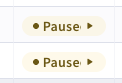
What I noticed: We need to increase the width of the stream status column. This might also relevant for other columns.
| onMouseLeave: { table: { disable: true } }, | ||
| rightIcon: { control: 'text', description: 'Icon name shown after the label, e.g. "pause"' }, | ||
| role: { table: { disable: true } }, | ||
| size: { control: { type: 'select' }, options: ['xs', 'sm', 'md', 'lg'], description: 'Badge size' }, |
Contributor
There was a problem hiding this comment.
Let's use the SIZES const here? Currently these arrays contain different values.
|
|
||
| const COLORS: BadgeColor[] = ['primary', 'danger', 'success', 'warning', 'gray']; | ||
| const VARIANTS: BadgeVariant[] = ['light', 'filled']; | ||
| const SIZES = ['sm', 'md', 'lg'] as const; |
Contributor
There was a problem hiding this comment.
It's great that you connected the actual badge prop types with the data we use in the story.
A small improvement would be to
- move these constants into the badge component
- Create the TS union type based on these constants
- import the constants here, to use them in the story.
With the current implementation it would be possible that we extend e.g. the BadgeVariant type without updating the related story.
linuspahl
approved these changes
Aug 28, 2026
linuspahl
left a comment
linuspahl
left a comment
Contributor
There was a problem hiding this comment.
Works well! It looks like the one e2e test failure is not related to this PR.

This file contains hidden or bidirectional Unicode text that may be interpreted or compiled differently than what appears below. To review, open the file in an editor that reveals hidden Unicode characters.
Learn more about bidirectional Unicode characters
Sign up for free
to join this conversation on GitHub.
Already have an account?
Sign in to comment


Add this suggestion to a batch that can be applied as a single commit.This suggestion is invalid because no changes were made to the code.Suggestions cannot be applied while the pull request is closed.Suggestions cannot be applied while viewing a subset of changes.Only one suggestion per line can be applied in a batch.Add this suggestion to a batch that can be applied as a single commit.Applying suggestions on deleted lines is not supported.You must change the existing code in this line in order to create a valid suggestion.Outdated suggestions cannot be applied.This suggestion has been applied or marked resolved.Suggestions cannot be applied from pending reviews.Suggestions cannot be applied on multi-line comments.Suggestions cannot be applied while the pull request is queued to merge.Suggestion cannot be applied right now. Please check back later.
Description
closes https://github.com/Graylog2/frontend/issues/43
adresses Stream status label changes requested in: https://github.com/Graylog2/graylog-plugin-enterprise/issues/14639
Extends the shared
Badge/Labelcomponent with a newcolor/variant/dot/leftIcon/rightIconAPI matching the current design system spec, entirely additive — every existingbsStyle-driven Badge/Label usage across the app keeps rendering unchanged. Migrates the Streams overview status cell to the new style as a first example, adds Storybook documentation forBadge, and fixes two pre-existing Storybook bugs whereBadge/Buttonshowed up as a genericForwardRefand their prop tables didn't render (both were missing adisplayName).Motivation and Context
The frontend currently has an inconsistent mix of ad-hoc status label styling across different pages (streams, event definitions, inputs, index sets, and others). This introduces the shared building block those pages will migrate to individually in follow-up PRs.
How Has This Been Tested?
Areas to test:
Badge/Labelunit tests, Streams overview status column, StorybookComponents/Badges/BadgeandComponents/Buttons/Button.Setup: the color tokens this PR depends on live in the companion
sawmillPR (/prdbelow), not yet published —yarn linkit locally to test against a running frontend or Storybook until that's released.Happy path:
yarn test --testPathPatterns=src/components/bootstrapandyarn test --testPathPatterns=src/components/streamspass; the Streams overview status column renders a light, dotted, colored pill; Storybook's autodocs pages show accurate prop tables for both components.Edge cases: existing
bsStyle/bsSize-driven Badge/Label usages elsewhere in the app are unaffected.Screenshots (if appropriate):
Streams overview status cell
Event Definitions status cell
Collector Fleet sources — Enabled/Disabled column
Stream output filter rule — Enabled/Disabled status
System Jobs status badge
Content Pack status badge
Input state badge
Types of changes
Checklist:
related Graylog2/sawmill#214
/nocl